

This conceptual feature for the popular online dating platform Bumble allows users to create postings that pinpoint the location of a brief interaction with someone they want to get in contact with. Inspired by the “Missed Connection” Instagram accounts created for college campuses. Using real-time location tracking, users can view postings on an interactive map or in the form of a feed with community monitoring features. Premium users have access to advanced features such as an unlimited feed and viewing/replying to posts.
5 weeks, Spring 2025
Sole Designer
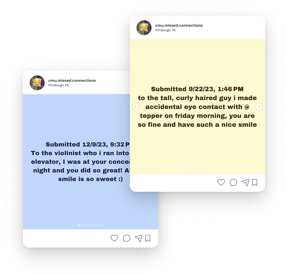
There is a real, existent interest in this type of feature that appeals particularly to a younger audience demonstrated by the existence of Craiglist's Missed Connections and Instagram pages created by younger users of the app for similar purposes, especially common on college campuses today.
“We’ve all been in countless situations where we had a cute but very brief interaction with someone. We think back and wonder why we didn’t ask for a number. Maybe we didn’t want to put someone on the spot, maybe we chickened out, maybe we were in a rush.”
—Reddit user

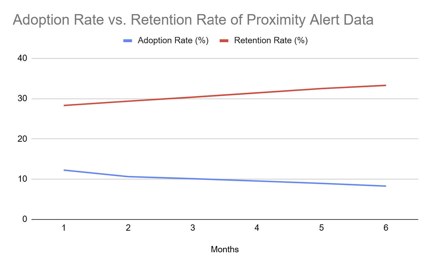

Both proximity alert and map integration features failed to maintain a growing adoption or conversion rate across 6 months. This indicates that there needs to be a point of interest to drive engagement with these features.
Users have the option to view missed connections posts in the form of a feed. Swipe up to view more posts. Posts upvoted by the community will appear at the top of the feed.
Free users of Bumble will only be able to view 3 posts as a sort of “free trial” to entice users to convert to premium.
The feed (list view) is default for mobile since it provides a more straightforward view that is easy to take in at a glance.
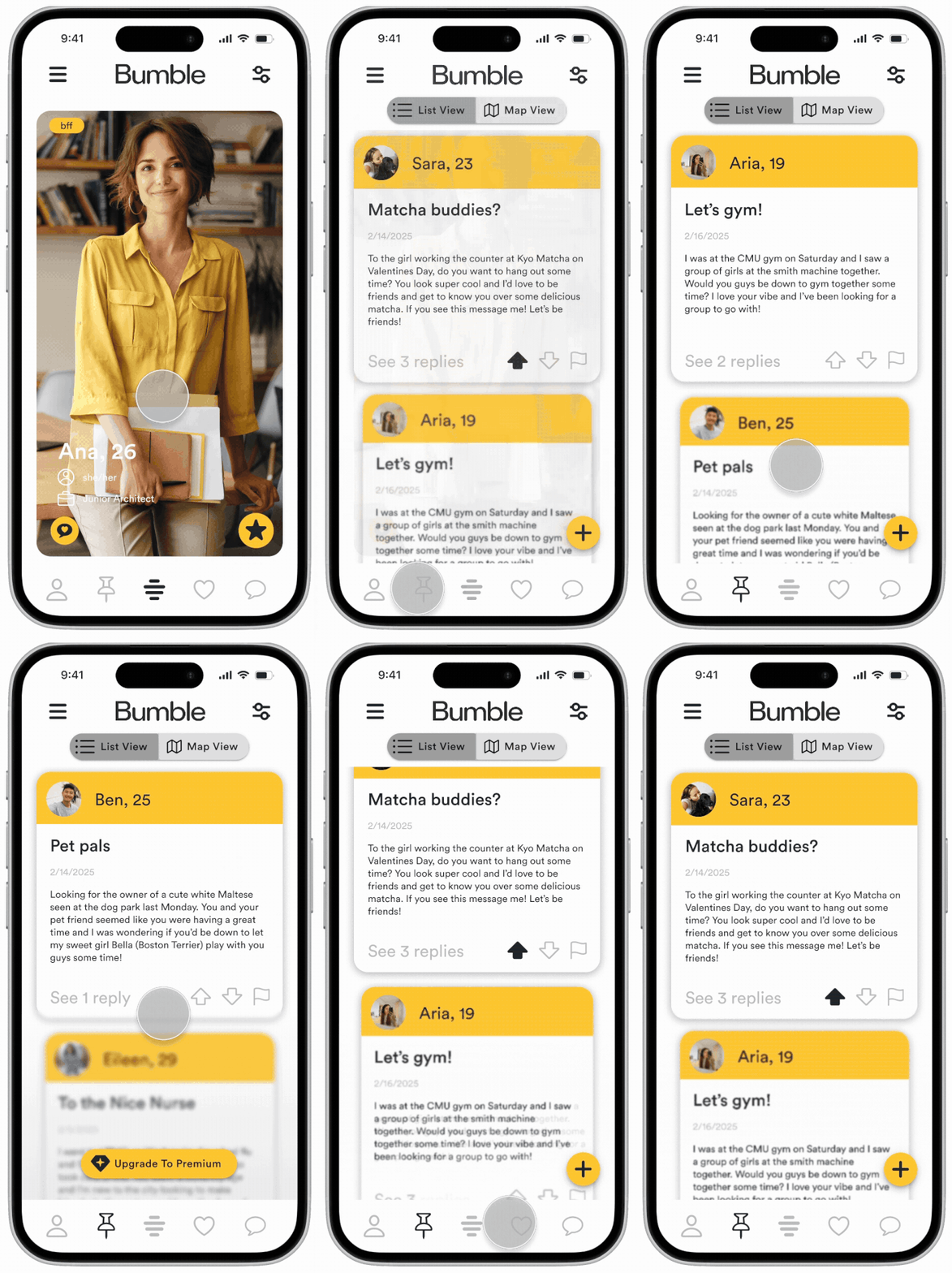
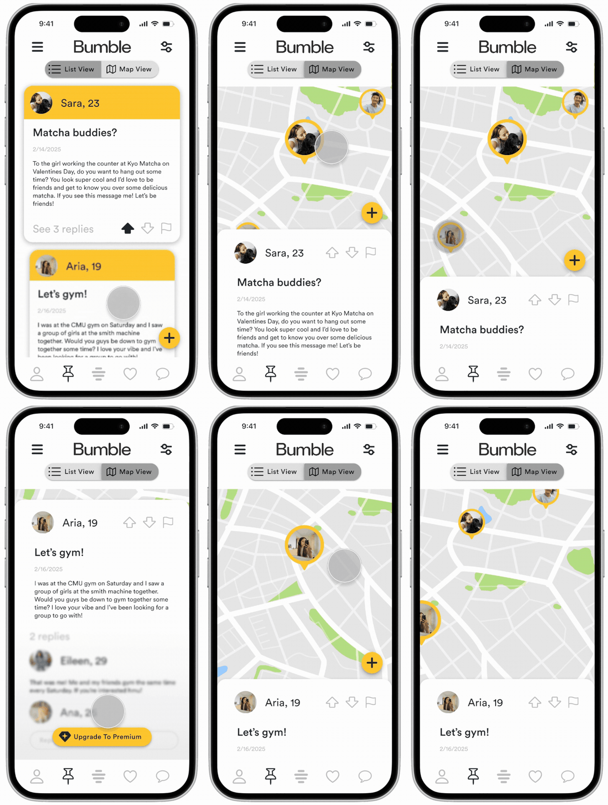
The map view provides a more detailed view of posts that allows users to interact with the original post, view replies, and select other posts to view through the map.
Free users are only able to view the original poster and post details. Replies are a premium feature to build interest and convert users to premium.
The map view is secondary to list view on mobile since there is more interactivity and more detailed information about postings.
Users have the ability to create posts at pinpoint locations by enabling location services. Posts include the account name, a title, the date posted, and a brief description of the interaction.
Within the location settings users can adjust the radius within they can see nearby posts and enable or disable location-based notifications for Missed Connections posts.

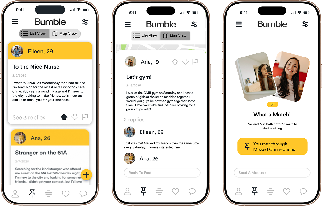
Premium users have access to an endless feed of posts. They can reply to posts and view replies from others. After replying to a post, premium users area automatically matched with the original poster. Bumble Missed Connections takes advantage of the opportunity for a feature that serves the purpose of reuniting missed connections, offers a wider audience than universities, and fulfills the evident interest in the existence of such a feature on a dating app to promote business success.
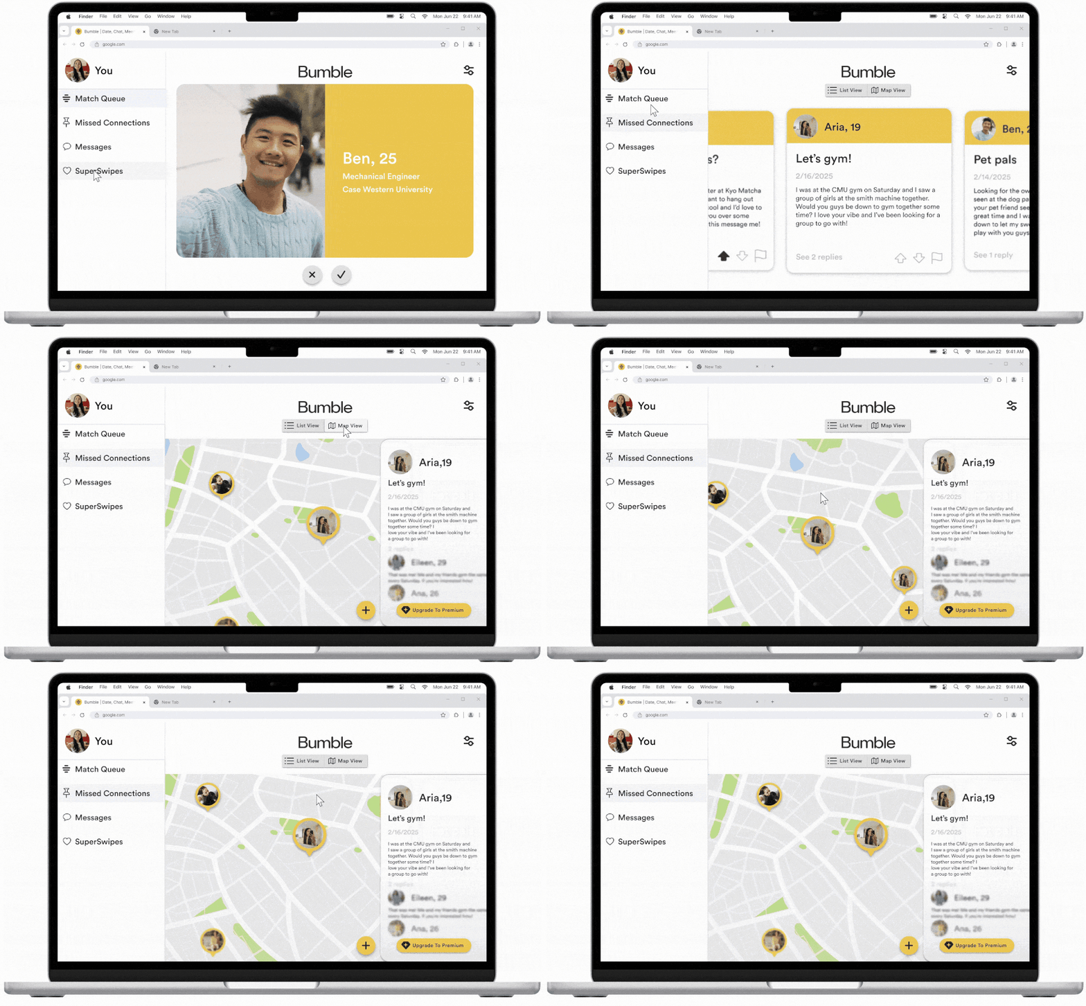
Free users are only able to view the original poster and post details. Replies are a premium feature to build interest and convert users to premium.
By clicking on different profile pins on the map, users can move between informational cards that slide in from the right for each post.
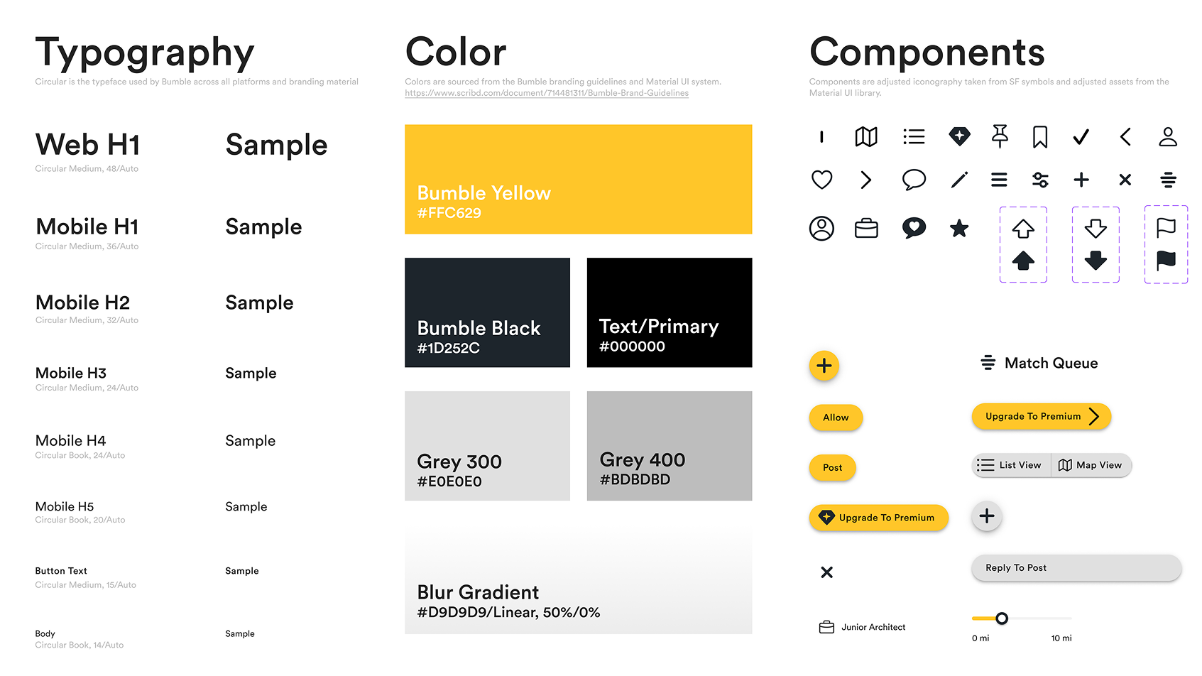
For this high fidelity wireframes and on, I used components from the Material UI Asset Library in addition to my own components, custom text styles, variables, and colors in order to generally reflect the appearance of the Bumble UI.
Circular is the typeface used by Bumble across all platforms and branding material. Colors are sourced from the Bumble branding guidelines and Material UI system.
Components are adjusted iconography taken from SF symbols and adjusted assets from the Material UI library.
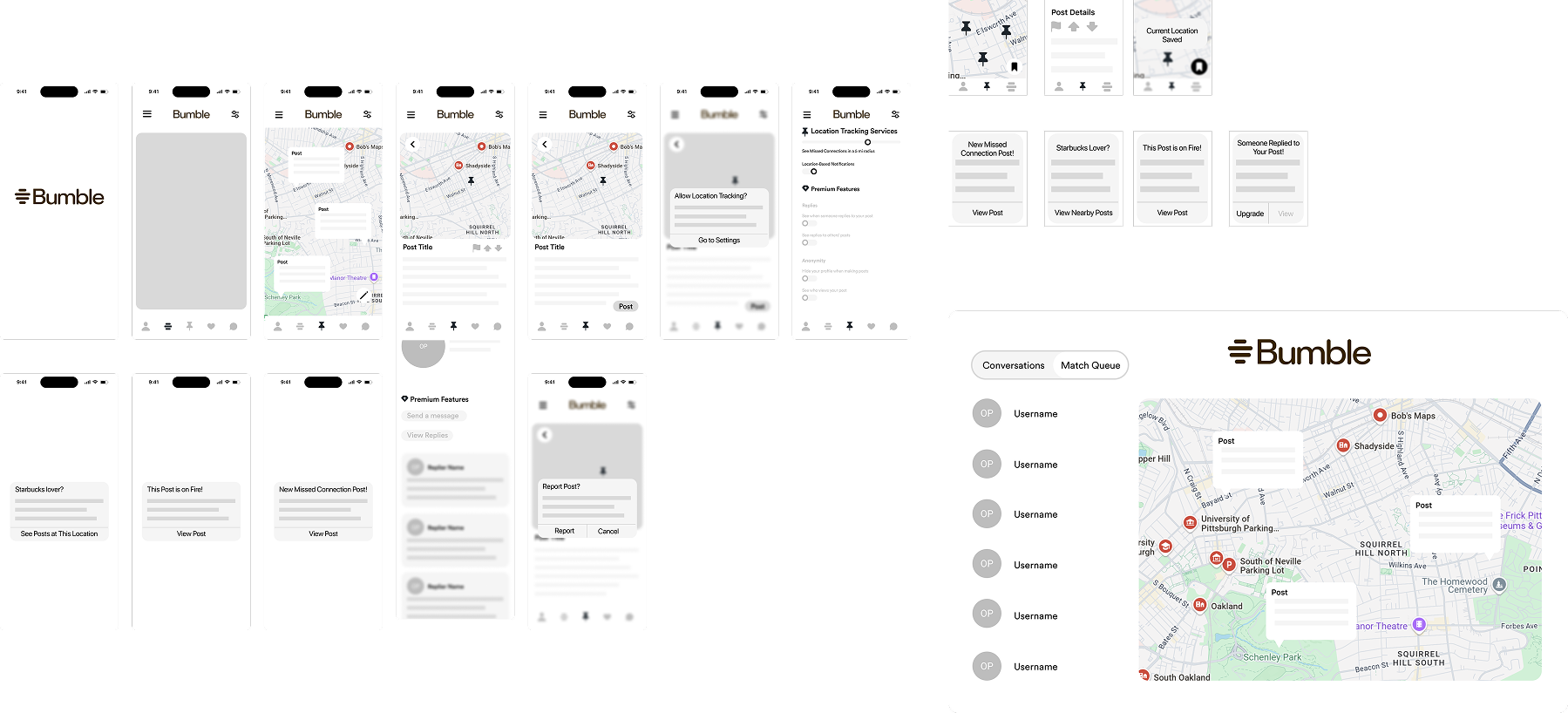

For the lofi wireframes I focused primarily on the user’s interaction with the map and how to structure posts on a map. A big part of the feature at this point was also push-notifications to drive interest among users using location tracking. Additional features included incongito mode (allowing users to post anonymously) and save locations for later to post.
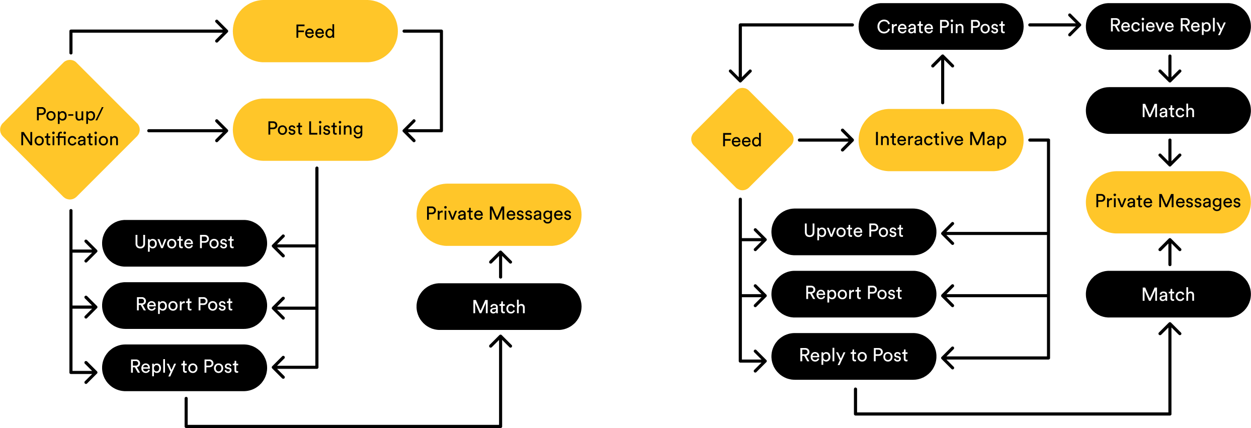
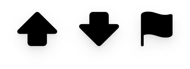
Community monitoring features such as upvoting/downvoting posts and reporting mitigate inappropriate posts.
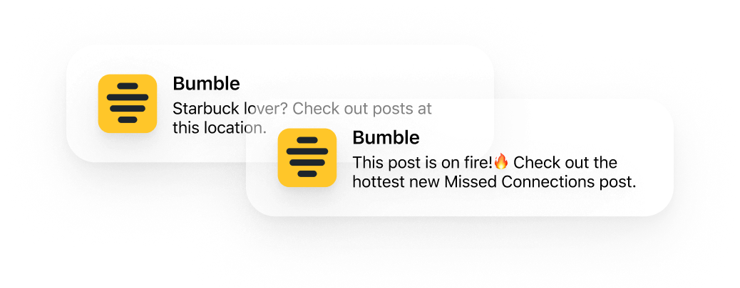
Location-based push notifications to create interest create new methods of engagement to create interest in order to entice users to enable location tracking.
I feel like this project was a really good experience for me to get experience working with existing design systems like MUI and also recreating Bumble’s existing UI. This was a valuable exercise in balancing aesthetics with functionality using new and pre-existing components, properties, etc. I think it was challenging for me to consider all the possibilities that needed to be accounted for in the concept and the prototyping.
I also thought it was valuable to look at this design/concept from a business perspective as opposed to just a user’s perspective. I had to learn to consider and employ strategies that are mutually beneficial for users and business.
Ultimately, I found this project to be an enriching process for me and I feel like I’ve learned many skills that are transferrable to my school work and my career. In the future, I think I’ll try to find a better balance between visual aesthetics and functionality within a design system.